Friday 13 December 2013

Life Drawing Sketches (oh my god an invasion of them)

SO, since I don't have a camera / a scanner / a smartphone / TIME, I've taken webcam pictures of my life drawing sketches! ENJOY.
Also I would like to say that I absolutely love the life drawing sessions, a lot of weeks they've kept me sane, and I'm so sorry I missed the last one this semester.


My first attempts at life drawing after many years' inactivity!
It shows!
One of the first attempts at adding colour. Shading's ok.


Adam! Because I arrived late and couldn't quite see and figure I should draw SOMETHING. : )


Gordon's proportions and a hand I'm quite proud of.
Movement thingies, with nunchuks!

A pig man, from when we drew from pictures.


A terrifying bodybuilder, from when we drew from pictures.


Gordon in a god damn horse mask on halloween, one of the funniest things EVER. Also these are the ones Gordon took pictures of for his blog. xD


Me trying really really hard not to lost the light, in one of the later sessions. Ooo back muscles.

One of the later sessions with extra butt!


That time when we drew more fabric folds than flesh! Fun times.

One of the later sessions, me being generally confused with my shading.

Our lady model! Worked almost entirely in pastels with this one, very happy with the results, obviously because of that, this is the photo that I couldn't get to translate right. Oh well.


Assignment Evaluation

Concept Development for Digital Application


The Assignment


To my understanding this assignment consisted of developing and presenting a character, a prop relating to this character, and an environment consistent with the setting the character existed in. We were expected to be able to present a prop sheet and beauty shot, an environment shot, and a character sheet and beauty shot, as well as any development sketches. We we were allowed to use any art media we wanted, traditional and or digital, and we could choose the themes we wanted to work with. There were few restrictions, which is always fun.


Initial Research and Scrapped Concepts


The first thing I did when starting work on this assignment was consider what I wanted to work on. Since I had the opportunity to pick the theme myself I wanted something I could have fun with. The first, easiest decision was that I wanted to create a female character, mostly because there’s a general lack of them. Bonus points if she is not a young woman, white, or conventionally attractive.
Some of the first ideas I had included;
- A middle-aged paladin type character with curly blonde hair, a devastating stutter, and an even more devastating proficiency with long spears, in a fantasy medieval setting (I know, tired, but I thought it was cute),
- A terrifying mermaid who collects body parts (think crooked, alien-faced, and I wanted her to decorate herself with teeth),
- A film noir styled scenario wherein a little girl’s twin brother has disappeared and she begins to suspect the father to have hurt him in some way (you would play as the girl if it were a game),
- A pirate queen.

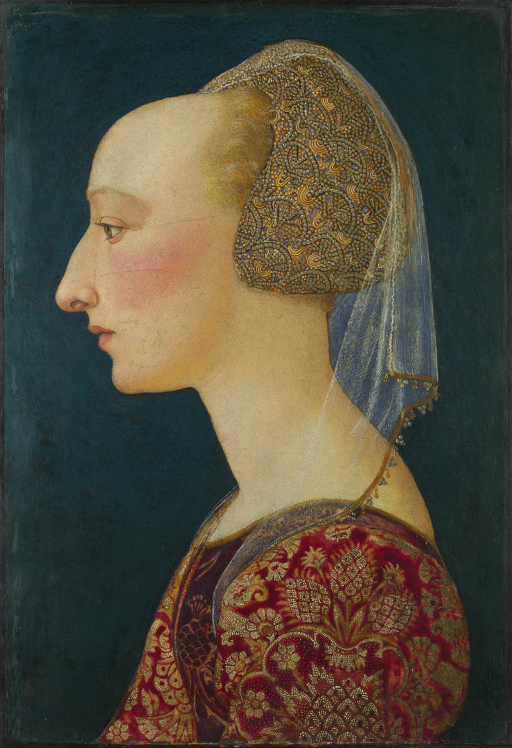
I kept starting mood boards and then scrapping them again. While I was googling different things trying to create a mood board for the mermaid, I found a picture of some spectacular scar makeup and somehow latched onto that image. It fitted with the TYPE of character I wanted to create. Eventually I found a painting of a woman handing a vial of brightly coloured liquid to a young man in huge, fine armour, and that’s when I decided on the alchemist theme. After a ridiculous amount of research I decided there would be supernatural elements to make the alchemy more interesting and more flashy, she would be a scholar and a woman of high status, and the setting would be loosely based on early renaissance Italy, considering the scientific advances of the time. Science was still a bit of a spectacle around then, and would blend better with the supernatural element, but it was still accepted and admired enough for someone to gain respect from. Adding all these elements together I figured my character would be highly educated, possibly noble, and a no-nonsense, hard kind of woman. I also found paintings of finely dressed women commanding scribes and workers, as well as one painting of a man dressed all in black, performing flashy alchemical “tricks” in front of a woman on a throne and a gawking crowd.

The Character


So I wanted my character to be head of the royal alchemy lab, a shady character who you’d maybe not entirely trust, but have no clear reason to mistrust. Someone who did her job well enough that no one really wanted to question her methods, and coming from a family wealthy enough to put her through the best education, as well as noble enough for her to be believably employed by royalty. She would possess a slightly sociopathic streak and be prone to anti-social behaviour. She would seem vaguely inhuman, look slightly “wrong”, but not alarmingly so. If she were to be put into a game, as a quest-giver most likely, I didn’t want the player to walk in and go “hey yo who the hell hired this woman she clearly starts her mornings by consuming the flesh of infant children”, which just ruins immersion, but I wanted her to be uncomfortable to look at. She should make your skin crawl. Her life would revolve around her science. There would be a lot of shady dealings going on in and around her lab. Her very, very influential lab.


The Prop

I made several prop mood boards before I found something I felt satisfied with. I googled lots and lots of alchemical equipment. Both fantasy-inspired and 100% real instruments, mostly from Europe. Eventually I found pictures of show globes, highly ornate “symbols” traditionally hung outside of pharmacies to sign that they were, well, pharmacies. This practice was most recently seen in America around the early 1900s, but I decided to use show globes anyway, because they were big and shiny and bright, and so very very pretty. They fit with what I wanted. Initially I wanted to just decorate the environment with them, but figured I’d incorporate them into character design, and she would wear it on her person in some way.


The Environment


The lab. I wanted to show what the lab looked like. Lots of apparatuses, questionable ingredients, assistants, scrolls and books and high pillars. Expensive but well-used. I’d already done lots of research that I could use for the lab, while looking for a suitable prop.
At an early stage I wanted a huge boiler in the middle of the room, but this later developed into a huge glass container. That would be the center of the room.


Designing The Alchemist


I had a slow start designing her outfit and her hair/headdress. There were so many options. I have a huge moodboard with just lots and lots of early ren and late gothic fashion in Europe. The dress needed to be that of a noble, wealthy, educated woman, but one who cares little for finery and who does a lot of hard work. The apron was a given from an early stage, although I explored other venues. I did some sketches to settle on a silhouette, and liked the “pregnant” dress best. It puckers around the high waistline, sometimes there would be a small cushion just under the waistline in the front, making you look, well, pregnant. Another thing I was dead set on including was the type of sleeve with fabric welling out of little panels. I drew some different ideas, asked a few friends for help, but didn’t find anything I really liked. For these first concepts I worked in colour, which proved to be a mistake. No matter what I did I’d screwed up the values from stage one, and the result was messy, boring, and samey. I scrapped them all and started over with grayscale, focusing on value rather than colour. This worked much better. I only created two concepts this way before I fell for one of them and decided to keep it. I created some simple colour palettes and tried applying them, posting the results on facebook and asking for input. I then tweaked and reposted before I decided. Towards the end I also added gloves to make her even less approachable. Also, it obviously makes sense with her handling probably toxic things every day. I also modified a historically correct garment she was wearing into a sort of cape.

The process with the hair was similar. I did a ton of designs for her hair and headdress, posted it on facebook asking for opinions, and tweaked. Mid-way through working on the hair I decided the face I’d previously painted was not weird enough. I tried a bunch of new colour palettes, each giving distinctly different impressions of her as a character, and ended up going with this very raw, fleshy, pink look, and white hair. It emphasised her facial scarring and made it look as if she’d gone through some very unusual things.  
For a while she was actually bald in my mind, but I eventually added hair, as I felt she was still creepy enough with it, but I wanted it white.
After face redesign I did another batch of hair and headdress concepts, and finally decided on one that seemed both practical and fine enough, keeping the hair in control with minimum upkeep without making her look less distinguished.

The prop development was very similar, I drew up a ton of silhouettes and asked for input. I went with a bright turquoise shade to pop out in the character palette without breaking it.
The environment was only briefly in actual development as it was the last thing I did, and I ended up rushing it and not working on it as deeply as I would have liked. However I did a few brief thumbnails and decided on two floors, and then the giant glass bottle would go from ceiling to bottom floor. The fumes from the contents of it would go straight outside. Like a toxic, magical chimney. Probably the birds in the area are hideously mutated. I did little sketches of a few of the apparatuses to be found in the lab, and added larger versions of the show globe she wears around her neck on one of the walls. I added in the floating glowing rocks to provide ambient lighting and a magical atmosphere.
During development I also gave the alchemist a name - Godelinde Traugott, a christian German name. I enjoyed the irony. I decided she was German while doodling her in my sketchbook and while drawing out her expression sheet. I heard her voice in my head as decidedly German, and I felt like it fitted. She would be a (fantasy) German noblewoman who moved to (fantasy) Italy because the sciences were more advances and more widely accepted there. She would have gladly severed all bonds with her clearly quite religious (to name their child Godelinde) family, as soon as she had the means to make her own money.


What I Have Learned


1: Lines are a waste of time, most of the time. It was useful to me to sketch out things initially, to define clearly to myself what I wanted, but when actually painting, big brushes were much more efficient and saved a lot of time.

2: But it’s important to make absolutely sure that everything reads correctly and is clearly defined, even to a viewer with no previous context.

3: I should do value studies first when designing something, and think about colour second. Otherwise it’s easy to end up with a confusing mess. Lead the eye properly with neat, effective value designs.

4: I should make more thumbnails/drafts than I think I need.

5: Keep colour palettes as simple and effective as possible. Don’t stray too far.


Conclusion


Overall this was a very fun project to work on, and I enjoyed it immensely. I especially enjoyed painting digitally again, as I’ve never properly explored that before. There’s a lot that goes into concept development and I feel really comfortable doing it, although obviously my execution needs a lot of polish. The end result was a little disappointing to me, and I’ll be honest, I’m upset with myself for not going as far with it as I wanted to. Nothing new there, I guess. But we’re all our toughest critics. Most artists I know are prone to making themselves absolutely miserable about the shortcomings of their own work. Nevertheless I worked really hard, and I’ll do better next time. It is clear by now that artistic skills are not enough on their own to create good visual concepts. This was definitely a learning experience.

Wednesday 11 December 2013

Alchemy Lab


Sketches and finished environment!
I'm not entirely happy with the finished one, it's... it just... it's lackluster. It needs more contrast, more definition and detail and a definite focal point - something I was hoping to create with the giant glowing thing, yeah? But the end result is too busy. Focus was supposed to go from the main character in the foreground, to the giant glowing thingie. I'm not sure that's what's going on...

But I AM happy with the concept. The finished piece just needs to look less amateurish. It WAS rushed, but eh, I have myself to blame. Next time I have to start earlier, and lay OFF the sketching already!
I lost so much time on the sketch, and then afterwards you have to paint over it and blend it back in, such a hassle.

Also with block colours there's no getting away from lazy values and boring, lazy palettes. No lines to save you and take attention away from value.

Basically let's not start environment pieces with a sketch ever again!

I like the thumbnail version better too, even though the perspective is technically off. It's more organic. Ugh. This happens every time. Oh well, it's done now.

Tuesday 10 December 2013

Final character design!


Final design!

Character Turnaround - Godelinde Traugott


She's got a name - a very ironic name - and here's the turnaround sheet thing!
Including a look at what the shoes look like because that could be useful.


Character Expression sheet


She's a generally very creepy person, it seems.
And german! Yup, apparently she's german.
I just felt like it worked, like it should happen. So it did.

Also her face colour palette and some proportion and nose studies.
I'll be honest I spent more time on the tiny noses up in that corner than on the actual expressions.
I just had a hard time pinning down her nose, and it was really important to get it to be consistent.

Oh and the bottom right one I'm sure what it is, but she probably just slit someone's throat.
Probably.

Prop Sheet


Prop Sheet turnaround!
That's it.
Not a lot of technique happening here, I know, the design was the difficult bit with this thing.

Wednesday 4 December 2013

Prop Thumbnails Detail

I detailed my favourites, adding some colour.
I've already pretty much decided on the top left, it has a very unique look to it. 

Tuesday 3 December 2013

Post-voting Tweaking

So I put it to a Facebook vote, as I usually do when I'm stuck.
The most votes went to the third one, the coldest one. Which I like, too, but again, I kind of like all of them...
Second most votes went to the middle one, the green one.
And ONE vote went to the top one, the orange one.
However that vote was my sister's, and I respect her artistic opinion as she's extremely talented, especially with colour (and I am not).
So I reworked all of them. The headdresses have all been darkened, and the colour distribution has been made more varied.

I reworked this entire thing, but using the same palette. The result is a little too pink, but very fun!

This one has been made less "dull". I have to say I really really like this one now.

This one is still very good, although with more variety.


LIFE IS HARD AND COLOUR PALETTES ARE EVEN HARDER.

Dress Colour Shemes


Some colour scheme ideas!
I'm havinga hard time deciding (nothing new there), but if I can settle on a colour scheme that suits her in general, I can tweak the smaller details later.


Final dress design and basic values


FINALLY.

Oh God So Many Dresses


 I started designing dresses and spent a good deal of time doing that, but it just wasn't working. I had to stop, I had to get the values pinned down, I needed more flexibility.


So I did a couple of designs in grayscale to fix the values. This is not entirely final, I think the overall final result should be darker. On the other hand, early ren fashion was quite bright. We'll see, but I'm reaching some kind of conclusion on this. The colours will be simpler this time. I'm going to settle on a strict, effective colour scheme and just.. stick to that.

Wednesday 13 November 2013

Show Globe Silhouettes


These are some basic silhouette sketches of different show globe ideas I have.
Also for the silhouette assignment!

Now to ask around to see which ones people gravitate towards. 

Dress sketches

These are rough sketches of different dresses.
Next I'm going to try to flesh out the "preggo dress"! That one in the second sketch, I really do like it. I have high hopes.


Italian Renaissance Portraits

The inspiration for my character's face.
I kind of looked at a bunch of portraits from the appropriate time period and created it from that.
I was happy with the first attempt though, and the face has never really changed.
It might in the future.
Obviously, I've sharpened the features to make up for the stylization of the paintings and to make her feel more, well, sharp. Also obviously, she has lots of scars. These people don't.


SO those were the relevant paintings. I love the crooked nose and the small, curved lips and I wanted those features to be very prominent. My alchemist has a seriously battered nose.


In later sketches I've added a visible fracture on the nose as well.
She also inherits the heavy eyelids and vaguely bulging eyes from the renaissance paintings.
However her bone structure is drastically different. I didn't want the childlike appearance that was the beauty standard at the time, I wanted her angular.

Obviously I erased a few things and redrew them in the process of this one painting, but this is the face I got on the first try and I'm quite happy with its general appearance.

Wednesday 6 November 2013

SHOW GLOBES YEA


So,
this beautiful shiny little trinket is not jewellery, it is in fact a show globe (also known as show jar).
It was popularly used in Apothecary windows throughout Europe and the US (later on) and even as
early as in the Roman empire.
I don't actually know if they were used in Italy during the renaissance but I've decided they're so shiny I don't even care. 
They were simply a kind of sign. You hung it in the window or outside the door and people would know that the place sold medicine. Or potions. In this case potions. And in this case, it will not be a shop but a royal alchemy lab, and the Royal Alchemy Lab will have its own show globe. A ROYAL one.
Ohohohoho...

Thinking the character will also be wearing a small one, as that did also occur. People did wear them. Well, not people, alchemists and apothecaries and such.

So, that's my prop idea. I'll get back to you on the rest.

Dress sheet start


Made my little sheet thingie template thingie to try out the dress ideas I have. The hair in the finished one is my most favourite hair/headdress so far, and that's mostly why I uploaded this! Also yeah there's a lot of pink going on so far.

Tuesday 29 October 2013

Hair/Headdress


The top two rows are before I fixed her colouring, but I'm pretty sure I'm always going to remain a fan of the cropped, eyebrow-less look for this character. It's well creepy.
And while I like the second and third of the second row, they're a teensy bit too common for what I'm thinking.

The bottom row are with the tweaked colours, and I've now realised that with red hair she looks mostly ginger and not so intimidating, so maybe I should go for a more desaturated hair colour...

So far number two, five and six of the bottom row are in the lead. 
Number two is probably the most mage-like one.

Monday 28 October 2013

Early Renaissance Headdresses


Boy, am I a fan

Crazy fleshy sleep-deprived evil


I threw together some alternatives for the colours on her face. They all quite dramatically change the feel of the character.

While I'm digging the crazy evil mage look, it feels a little bit extreme.
I considered making her scars kind of glow, too. It is possible they glow when she performs certain kinds of magic, I have to draw that! Like as if her flesh is luminescent and the scars haven't healed perfectly well so it leaks out.

The sleep deprived makes sense, but makes for a pretty boring colour scheme.

The pretty one has it's own charms, the kind of disturbing, deformed beauty with a wicked interior. But I just... don't like the look, not for her. It's not no-nonsense enough.

In the end I'm pretty sure it's between raw and fleshy and the muted, purplish colours.
Perhaps I'll combine them and make the scars fleshier, the skin shinier, and the eyes a little more bloodshot.


UPDATE:

I thought the general colour scheme needed more fleshing out so I redid them with some accent colours, as well as more defined looks.
After the tweaking they all look a lot more appealing.
I also removed the glowing eyes from the crazy evil mage one, to make it less WHOA LOOK AT ME I AM EVIL PLEASE HIRE ME TO BE A ROYAL ALCHEMICAL ADVISOR (I promise not to sacrifice the servants all in one go).

But this makes it harder because now either could work.
I still think the upper left one is a bit too pretty.

CDDA: Renaissance Occultism

The next assignment for Concept Development for Digital Application requires us to develop a character, a prop and an environment.
Again, I wanted a female character because well, there's a general shortage of those.
I did NOT want a warrior character, although I examined the possibility, focusing for a while on a misguided paladin with a bad stutter; I had a basic concept down when I changed my mind after I found this:


This is Jessica Alba starring in the 2010 feature The Killer Inside Me.

And those are some rad looking scars. I mean, some rad looking scar SFX makeup. I looked into a number of ways to implement this into different characters, and it had started going SERIOUSLY downhill (into some dark places even I was just not comfortable explaining to anyone else), so I had to stop myself and decide to combine it with something a lot less gruesome, something I enjoy researching and drawing.
So that is how I ended up finally settling on the 15th to 16th century time frame; I really enjoy drawing the fashion. Obviously this is early renaissance. I combined this fact with the crazy scars and it turned into a lady scientist concept, which then developed into a lady alchemist (the lines back then were blurred anyway), but then I felt like it was lacking a fantastical element so I added an occult aspect. 

The final idea is now a female court alchemist in late 15th century Europe (Italy, for maximum renaissance mood, although it's possible I'll draw influences from surrounding European countries within the same time frame, as Italian fashions were at the time a tad benign and very extravagant) with some very questionable behind-the-scenes habits. The kingdom is only based on the real life setting, as I didn't want to limit myself to real, proven alchemy instruments and techniques (as well as historically accurate costumes). And also I want some real, bloody magic in the equation when there's a vaguely immoral alchemist involved.

So in summation: awesome scars, awesome gowns, illegal magic.


Monday 7 October 2013

Vending Machine assigment! Colour concept 3/4 view
Assignment: Design a vending machine in any style you like.
Thumbnails and technical/turnaround sketches